
Clean care Laundromat
The brief for this project was to create a comprehensive brand design for CleanCare, a new eco-friendly laundromat. This all-encompassing project drew on the full breadth of my design expertise. Working closely with their marketing team, I crafted designs that authentically reflected the company’s mission and spirit.
Art Direction
✧
Brand Identity
✧
Web Design
✧
Art Direction ✧ Brand Identity ✧ Web Design ✧

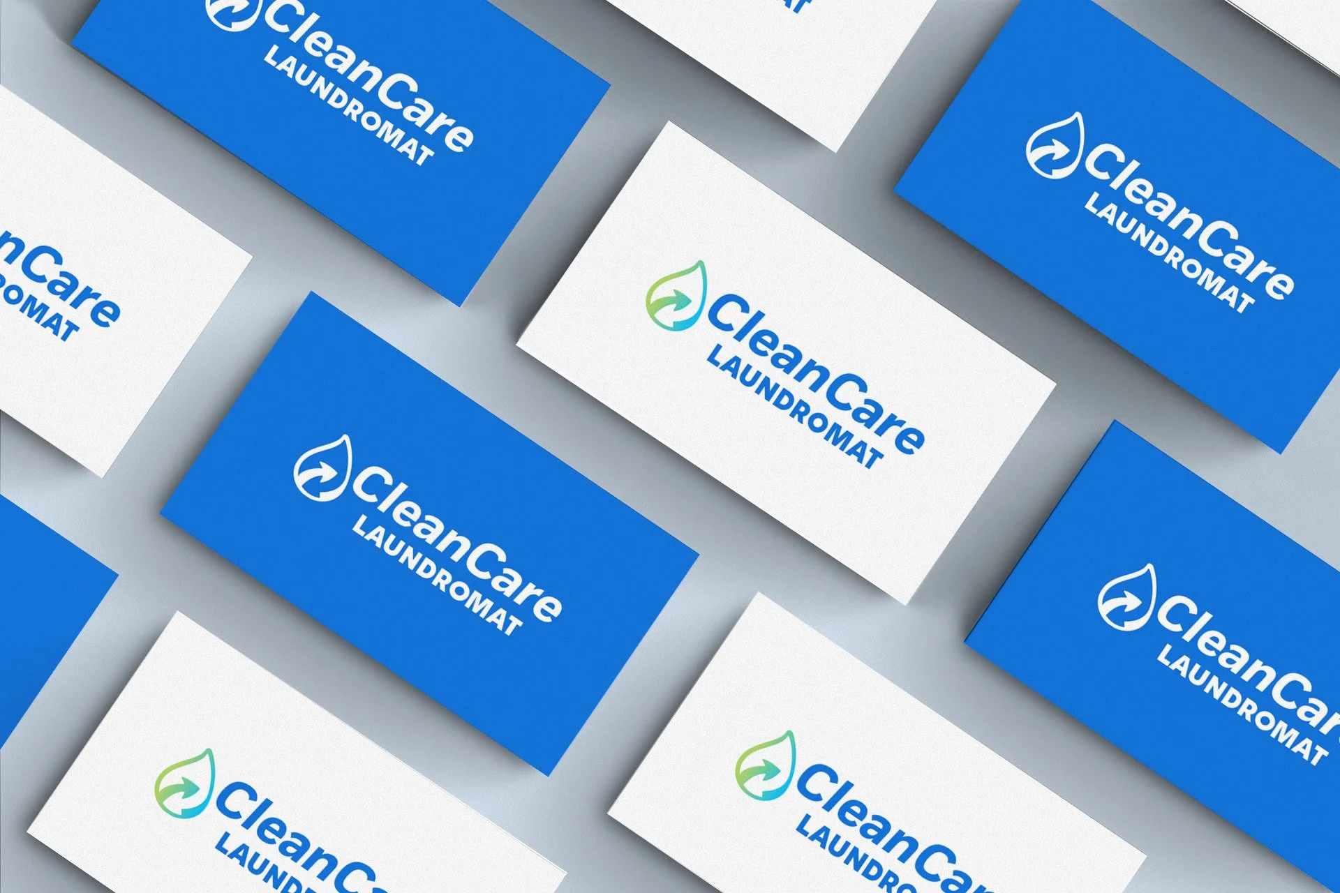
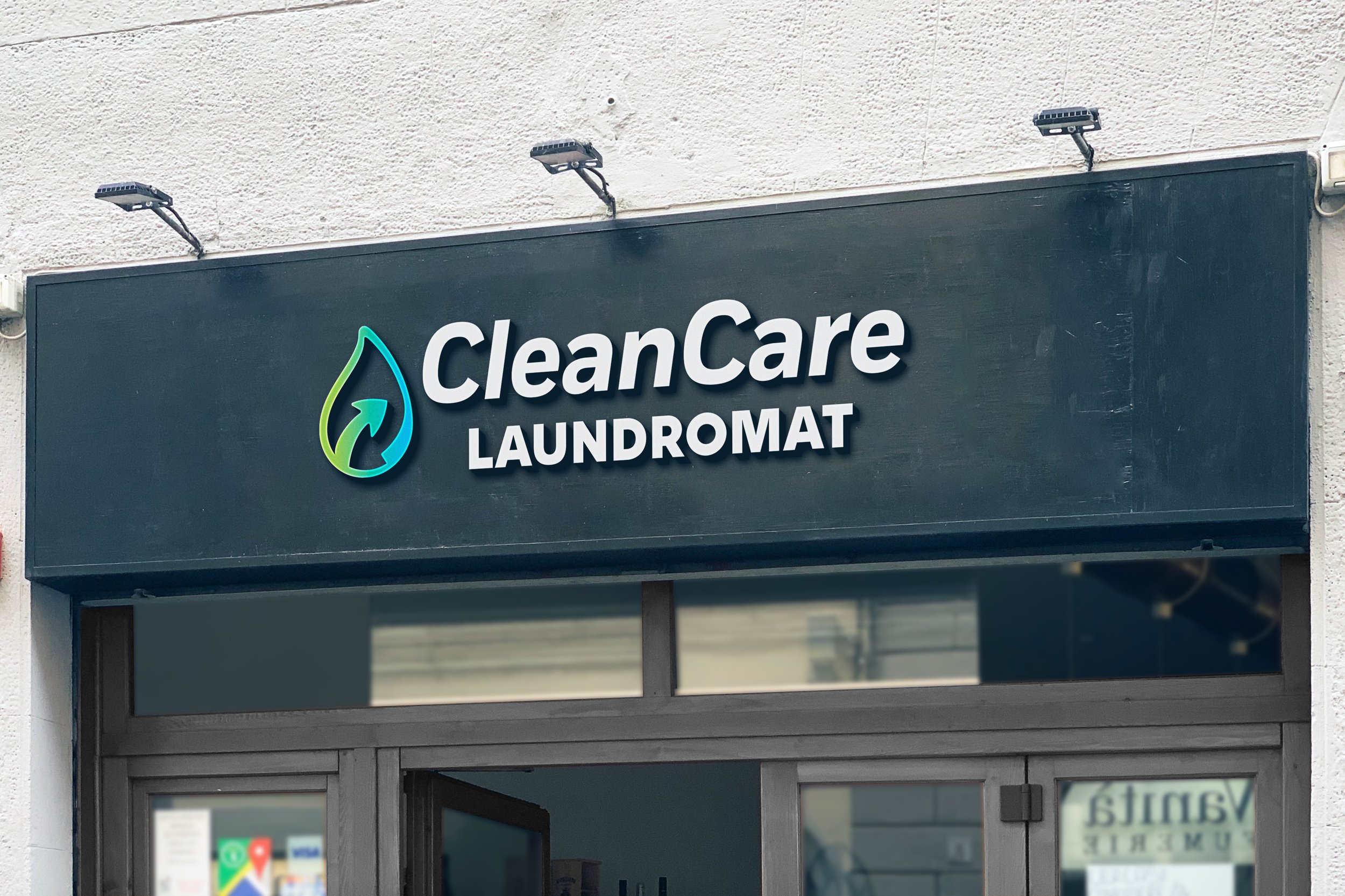
Logo Exploration & Design
The process began with an exploratory phase yielding several iterations of the CleanCare logo using a serif font. We found it too playful for the brand's desired aesthetic. After selecting Fort as the primary brand font, we chose the bold italic style to give emphasis to the brand name.

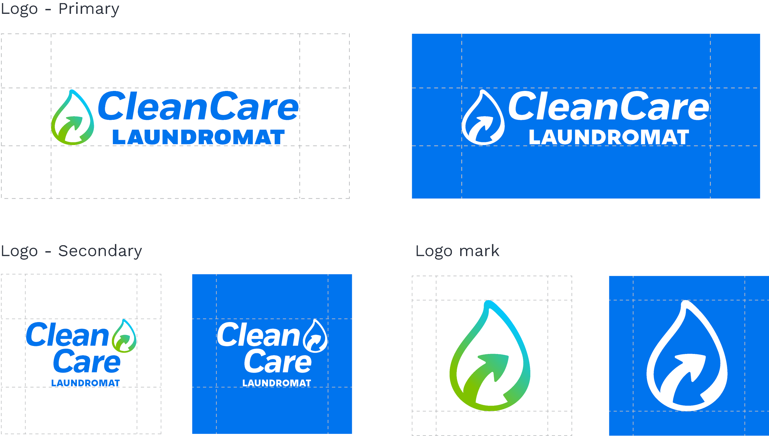
The logomark draws from three key inspirations: nature, water cycles, and the laundry process. The CleanCare logo combines the logomark with an italicized brand font that mirrors the arrow’s motion. The word "laundromat" is set in a bold sans serif to highlight the brand's core function.
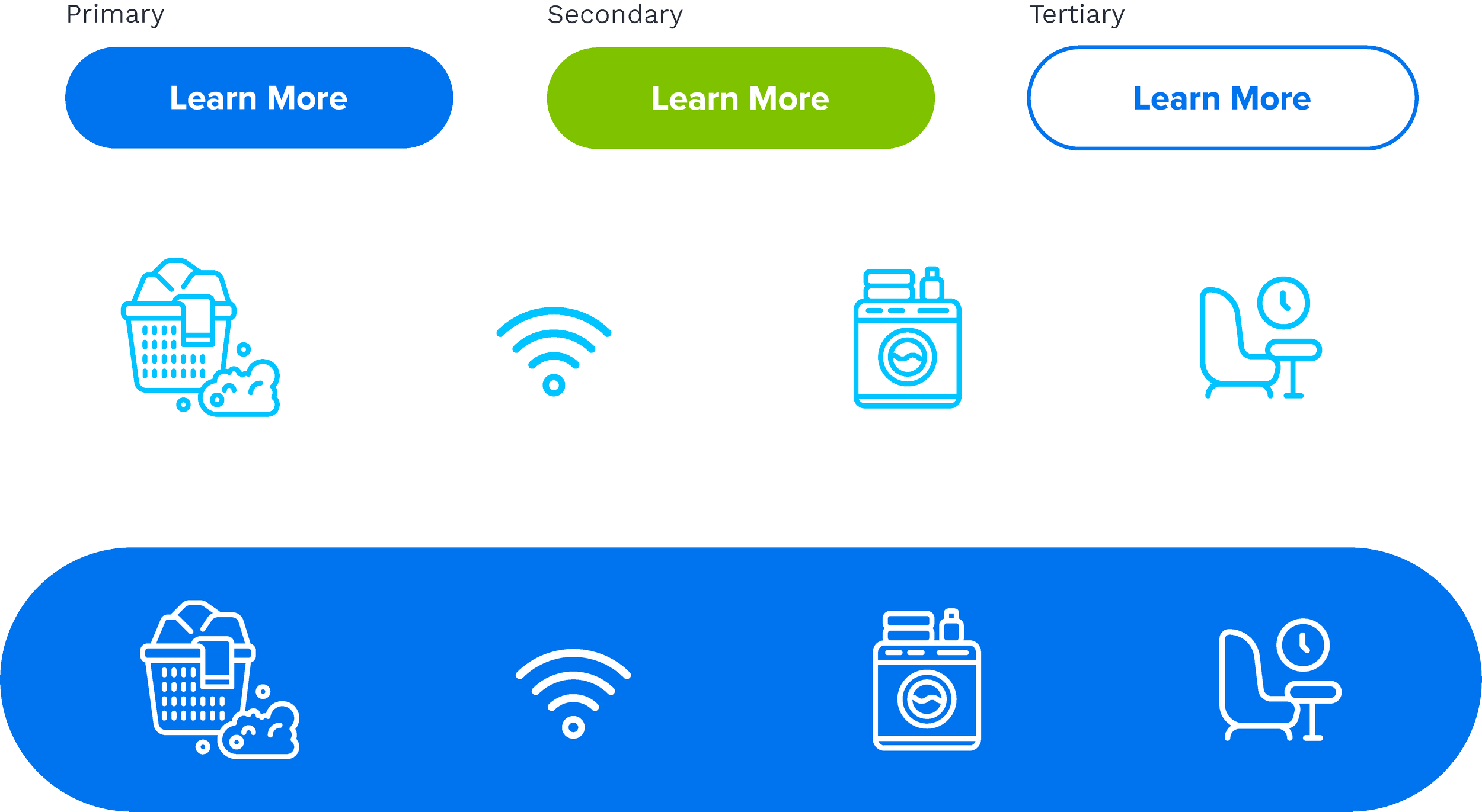
Design System
CleanCare’s design system combines minimal iconography, pill-shaped buttons, and a clean, bright color palette. The icons feature outlined, rounded illustrations that ensure ease of use and scalability across platforms, while vibrant blues and greens reinforce the brand’s eco-friendly mission. Gradients add depth and contrast, giving imagery a polished yet approachable feel.

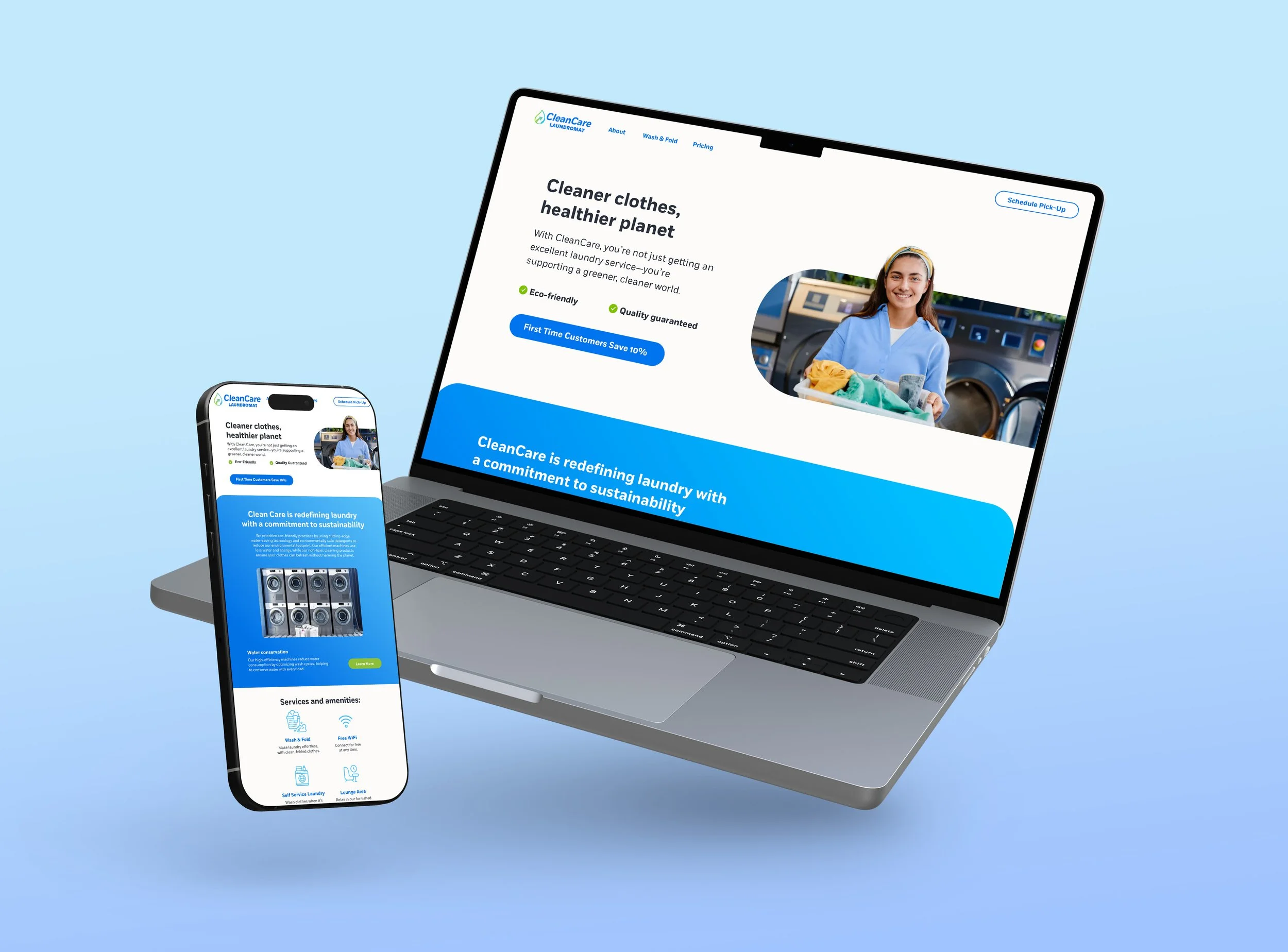
Web Design
For CleanCare’s homepage, we landed on a 12-column grid layout in Figma with the following specifications: columns 1 and 12 as margins, and content arranged in columns 2-11. The layout can be adapted for various desktop and mobile views.

Pressed and Perfectly delivered
This project showcased the scope of my design expertise and, through close collaboration with CleanCare’s marketing team, resulted in a brand identity that authentically reflected the company’s mission and spirit.