
Clean Care
Art Direction
✧
Brand Design
✧
Web Design
✧
Art Direction ✧ Brand Design ✧ Web Design ✧

The brief for this project was to create a comprehensive brand design for CleanCare, a new eco-friendly laundromat. This all-encompassing project drew on the full breadth of my design expertise. Working closely with their marketing team, I crafted designs that authentically reflected the company’s mission and spirit.
Logo - Primary


Logo - Secondary


Logo mark

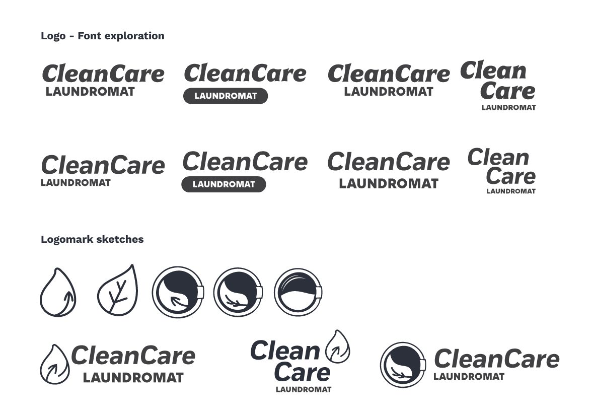
Initially, I explored several iterations of the CleanCare logo using a serif font, but found it too playful for the brand's desired aesthetic. After selecting Fort as the primary brand font, I chose the bold italic style to give emphasis to the brand name.
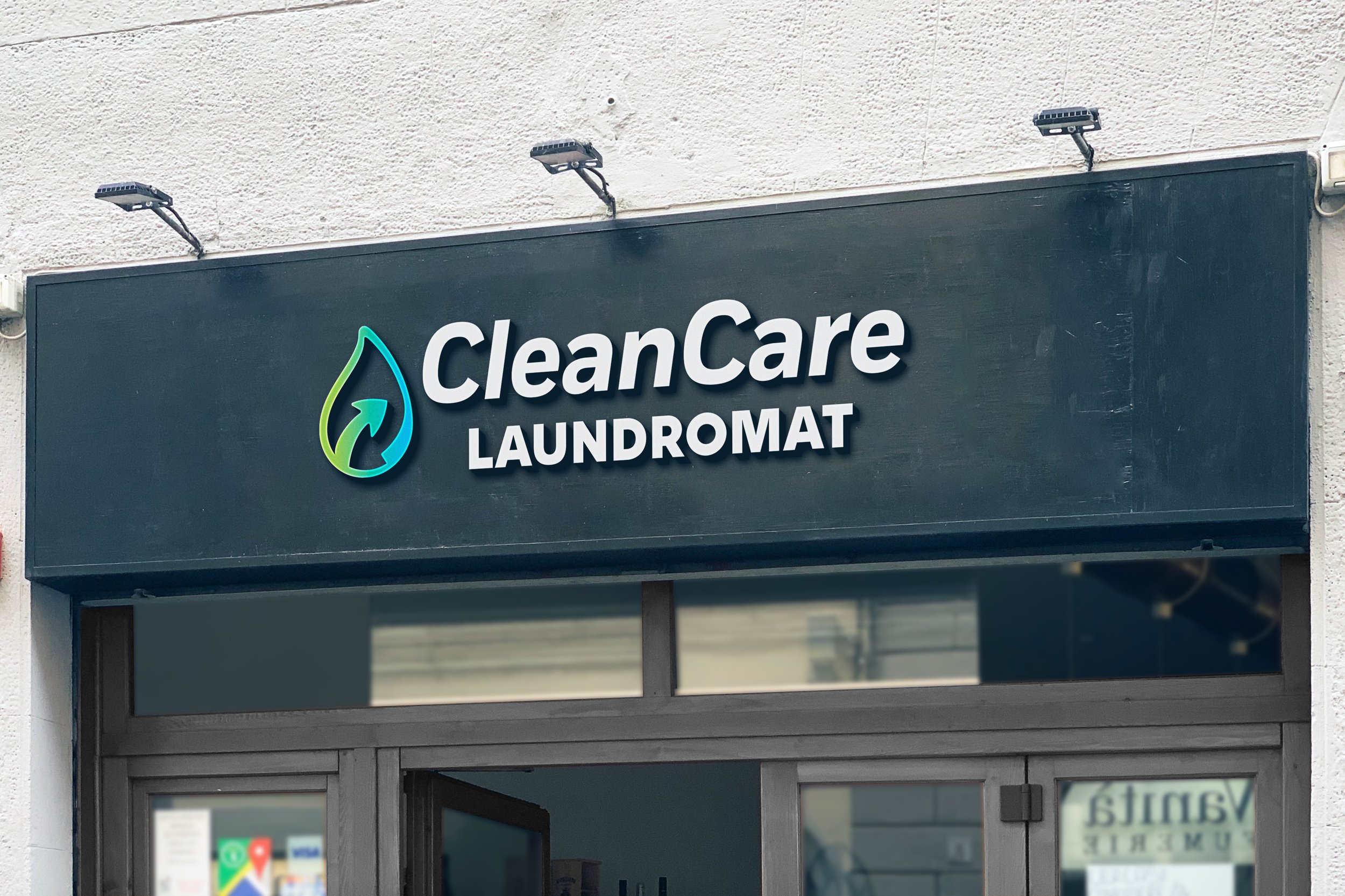
The logomark draws from three key inspirations: nature, water cycles, and the laundry process. The CleanCare logo combines the logomark with an italicized brand font that mirrors the arrow’s motion. The word "laundromat" is set in a bold sans serif to highlight the brand's core function.

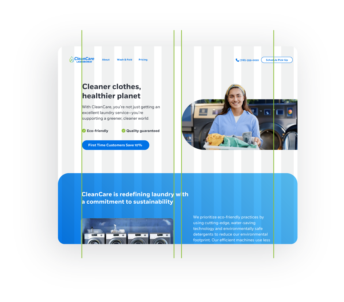
CleanCare’s design system combines minimal iconography, pill-shaped buttons, and a clean, bright color palette. The icons feature outlined, rounded illustrations that ensure ease of use and scalability across platforms, while vibrant blues and greens reinforce the brand’s eco-friendly mission. Gradients add depth and contrast, giving imagery a polished yet approachable feel.


The project delivered a professional, elevated branding experience for an eco-friendly laundromat. From comprehensive branding touchpoints to engaging visuals, the result would position the laundromat as both recognizable and appealing within its neighborhood.